Cabling Company Website Design
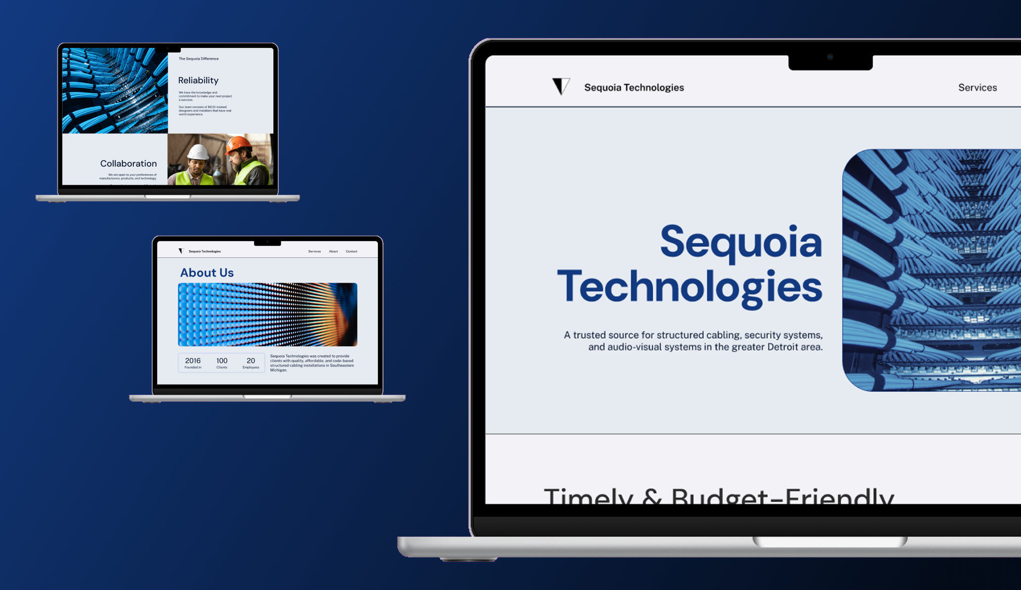
A small cabling company's website design and refreshed branding.
Freelance UX Designer
January - March 2026
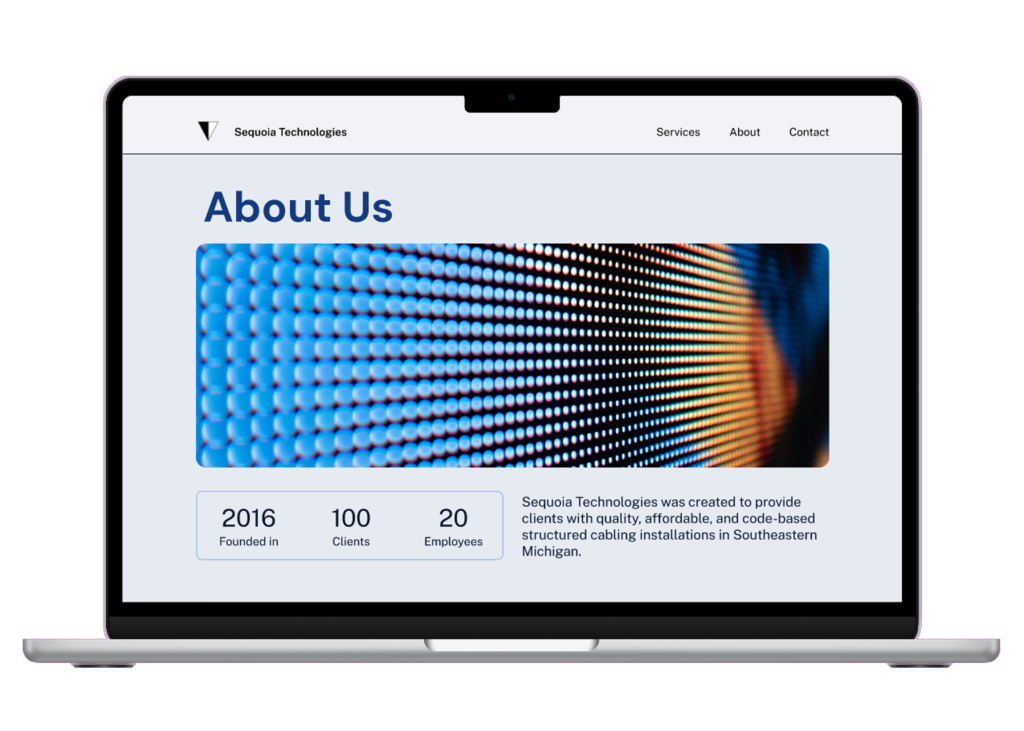
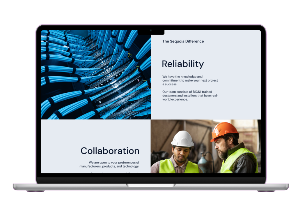
Sequoia Technologies is a small structured-cabling company in Michigan. They wanted to improve visibility and branding with an updated logo, brand colors, and marketing website.
This project was completed independently by me. I covered competitive research, brand guidelines, writing copy, designing, and building in Webflow.
1
branding
Branding #1
Brand Values
I defined the main characteristics of this company to use as my guiding principles for the tone and personality of copy and visuals.
"No Open Items."
A guarantee that everything will be worked on until absolute completion.
Creating custom solutions that are accessible for clients from educational institutions to food production facilities.
Will always offer materials and services at a fair price.
Branding #2
Updated Logo
I adjusted the logo to be more uniform while maintaining legibility and recognition.
Old

New

Branding #3
Brand Colors
I chose blue as the main brand color to evoke feelings of trust, reliability, and security. The vibrant shade gives the color more energy. Pairing it with a vibrant yellow-green accent adds to the excitement and gives the feeling of youth and modernity.

2
design preparations
Content Preparation
Writing Copy
I began by scraping all existing copy from the company's old website and other marketing materials. I created a tone that is approachable and professional. We wanted to communicate that the business is reliable in its outcomes, but more affordable than its competitors.
A key advantage of Sequoia Technologies is the relationships that are built with clients, and I wanted this trust and friendliness to appear in the design.
Research
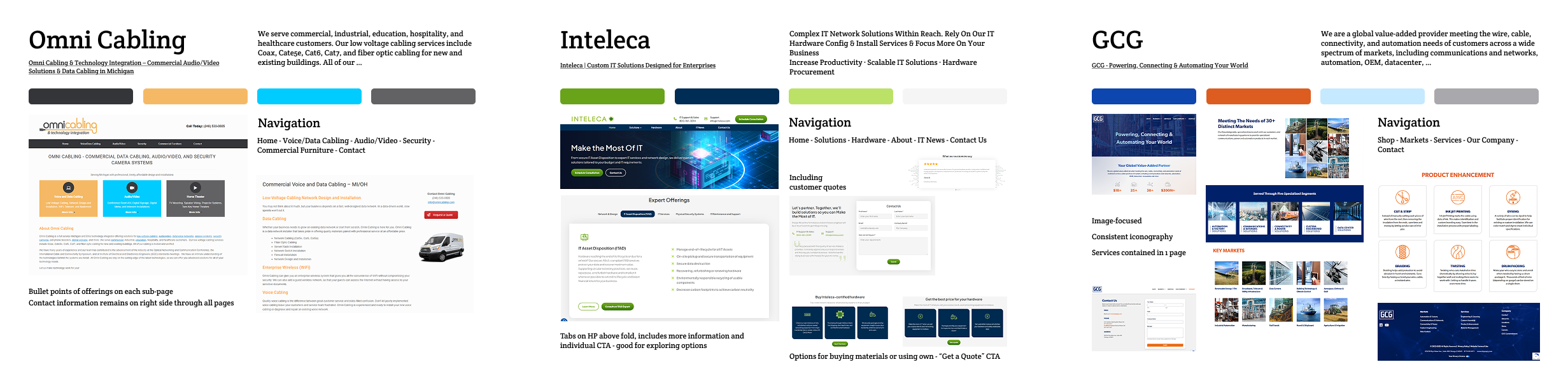
Competitive Research
I researched the marketing websites of other small structured cabling companies in the area, as well as large-scale corporations. I noticed many competitors lack information hierarchy and clear descriptions of offerings.
I applied this knowledge by emphasizing images and keeping copy simple and straightforward, and using whitespace to reduce clutter and make the information more digestible.
UX Design #1
Information Architecture
With my gathered marketing materials and research about competitors’ information hierarchy, I designed a simplified site map.
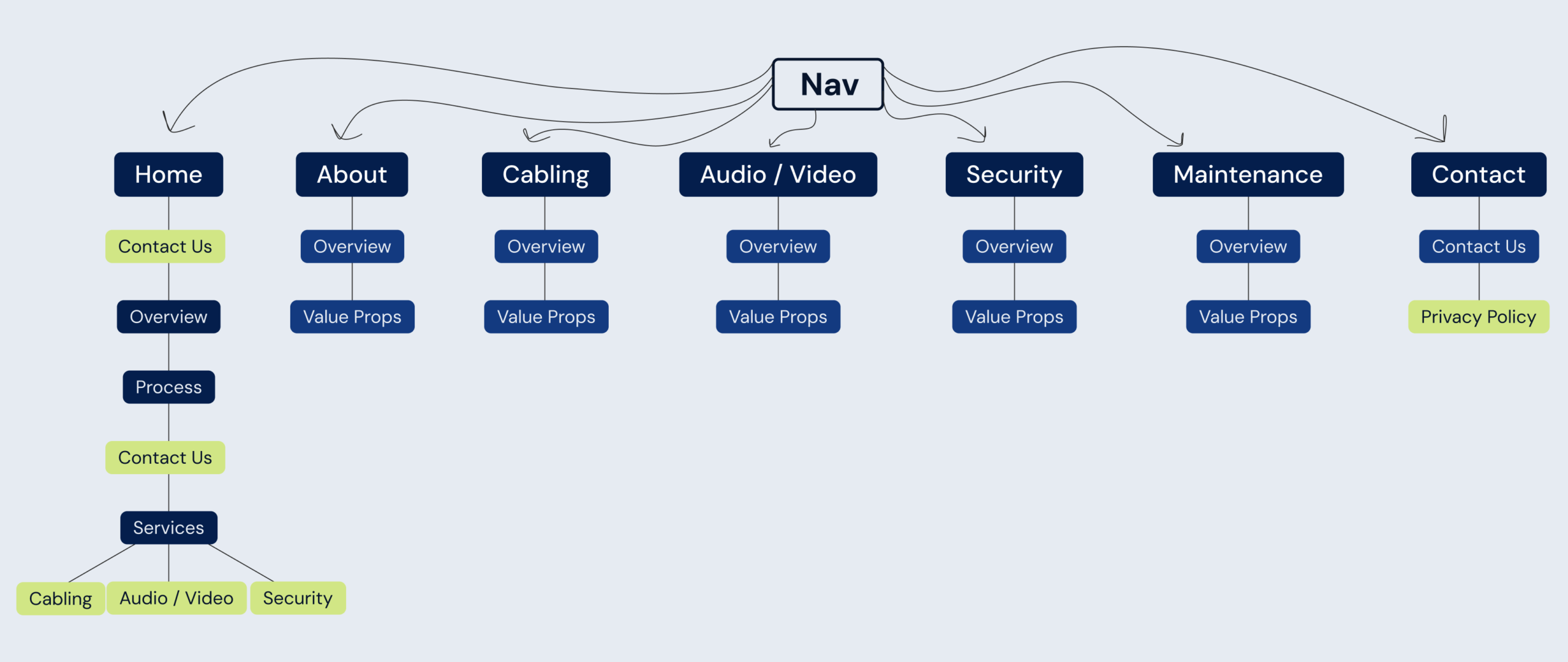
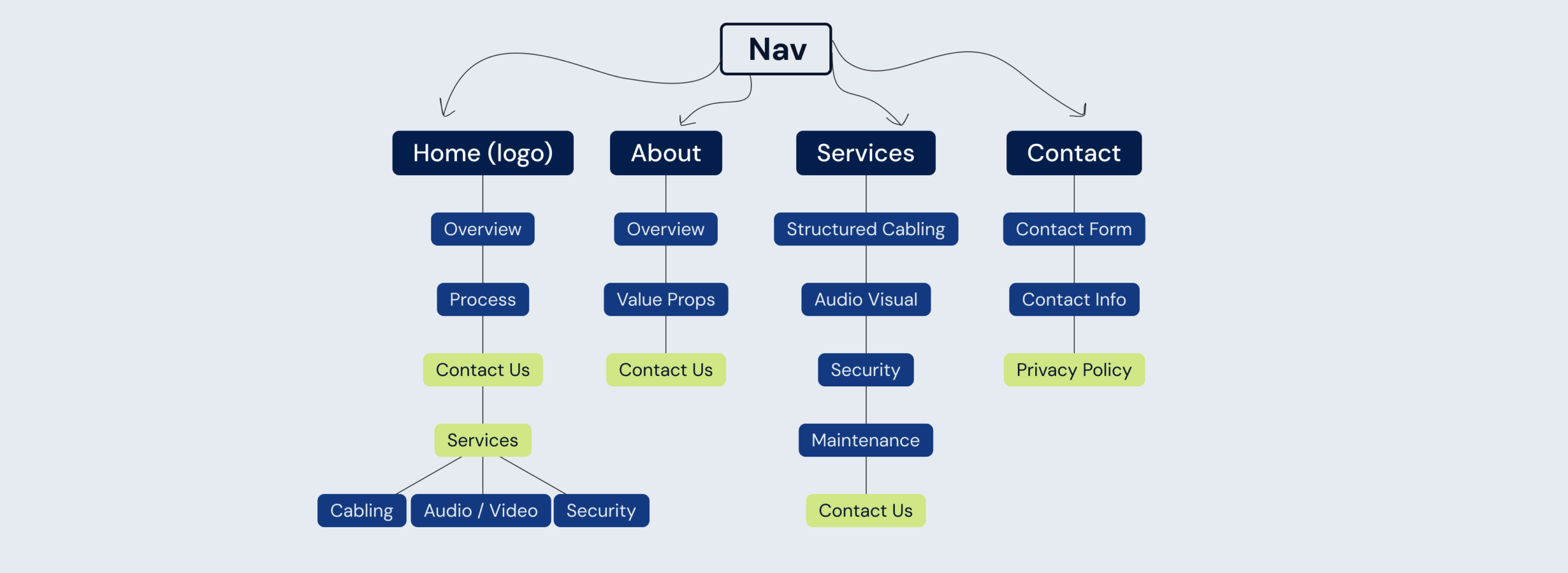
Below are the site maps displaying the information contained on each page accessible from the nav bar. The green boxes are CTAs.
Old Page Hierarchy
Redundant information and no CTAs on pages.
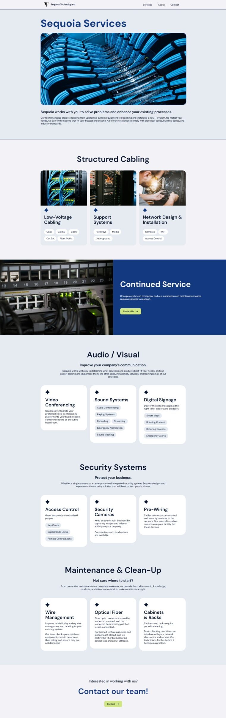
In their previous site, they included 5 pages for services using recycled copy and no clear CTAs. My solution was to combine all services on one page due to the overlap in the offerings and split this page into anchored sections.
New Page Hierarchy
Consolidated information and increased CTA access.
This is easier for users to navigate and exposes them to multiple offerings, which is useful given the brand value of flexibility. This reduces cognitive load in the navigation and simplifies the user journey which supports the design features of minimalism and clarity.
UX Design #2
Website Design Features
Combining the research and defining characteristics of Sequoia, I decided what traits are most important for this website. How can I accurately represent Sequoia while improving upon their competitors?
Business objective is reliable and straightforward solutions. The website design should reflect this effective approach.
Explain offerings in the most concise manner while remaining accessible to all specialized knowledge-levels.
Competitive analysis showed me comparable businesses have outdated sites with unclear navigation. A clear and well-functioning interface is a competitive advantage.
Deliverables
Final Designs
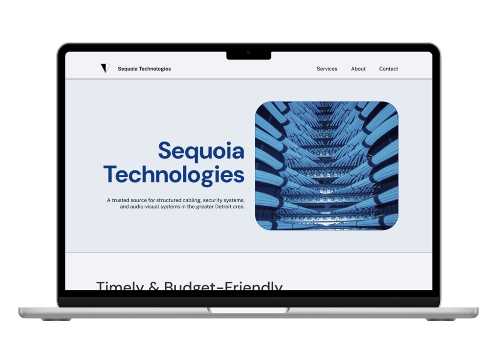
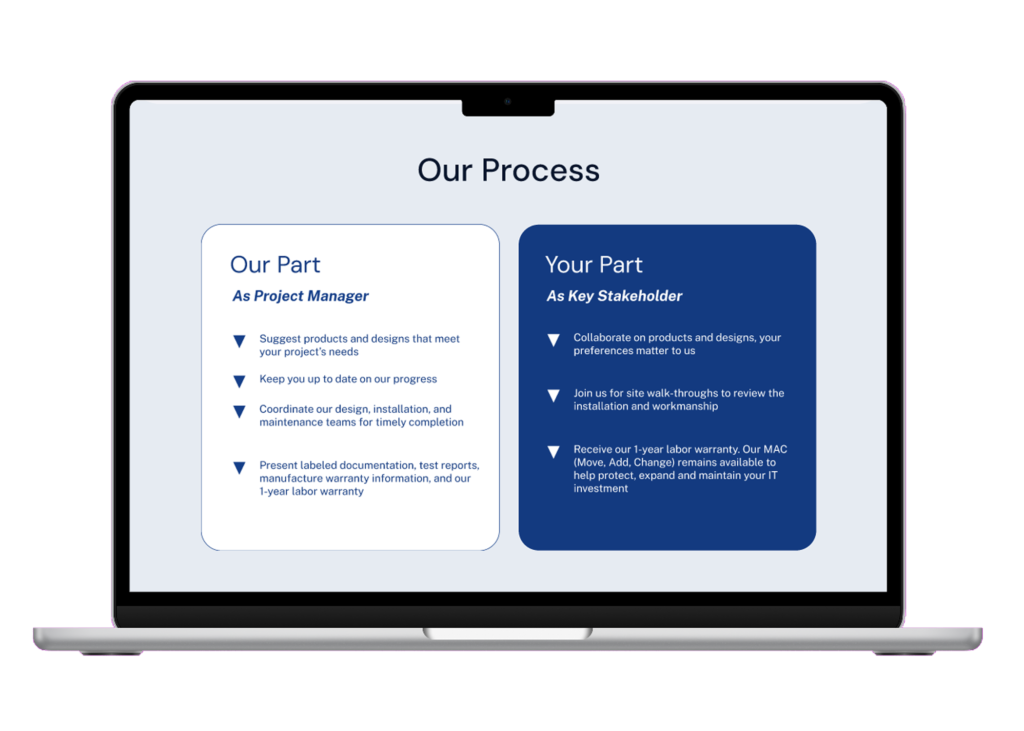
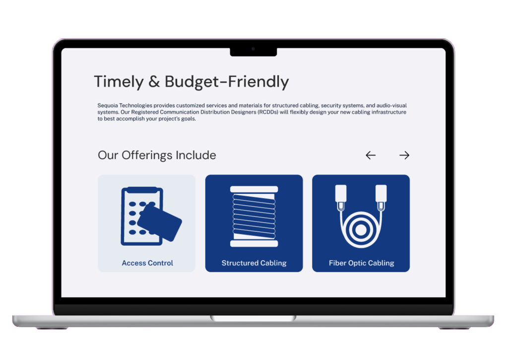
After the high-fidelity mockups were approved, I developed the designs using Webflow.