Genomic Start-Up Website Design
Redesigning a genomic technology start-up’s website to accommodate two distinct audiences.
Freelance UX Consultant
2023 - 2026
The marketing team at a genomic intelligence start-up moved their website from WordPress to Webflow. This opportunity allowed for a more user-friendly redesign. My role from 2023-2025 was assisting in the data transfer, designing new information architecture and webpages, and developing in Webflow.
In 2026, the team requested a rebrand as they moved toward new marketing initiatives. My role was to create new brand guidelines and create mockups for a more modern and clean appearance on the website.
1
branding
Design Inspiration
New Direction
This technology-focused company wanted a new creative direction that felt cleaner and more modern. They pointed to several examples and these were the features I noticed:
Increasing font sizes and decreasing weight. Body copy with extra space in the line height.
Using soft colors, gradients, and low-contrast blocks.
Large margins on the page and between elements.
Branding Decisions
New Style Guidelines
Lower contrast, lightweight typography, and reduced color scheme.
Gradients for gentle transitions and brand color incorporation. Variation in typography for more visual interest with limited imagery. Organic shapes and a designated color for interactive elements.
Three Colors
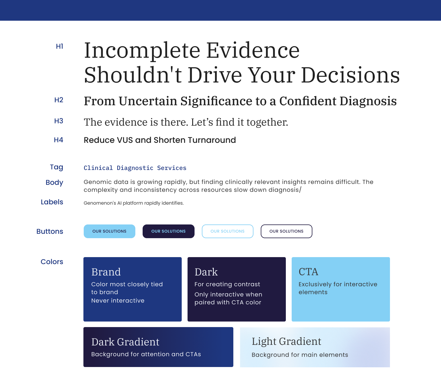
I reduced the color branding from ten colors to three. This includes the main brand color, a color exclusively for interactive elements, and a darker accent for contrast.
I also included two shades to be used in light background gradients which are close to the designated off-white background color. This maintains the branding while providing low-contrast ambiance across the site.
Font Choices
The font choices represent our key demographic by being recognizable from published scientific papers. Spectral is often used in medical journals, and monotype in used for genomic notations. These choices will feel familiar and trustworthy to our audience.
UX Decisions
Interaction Design
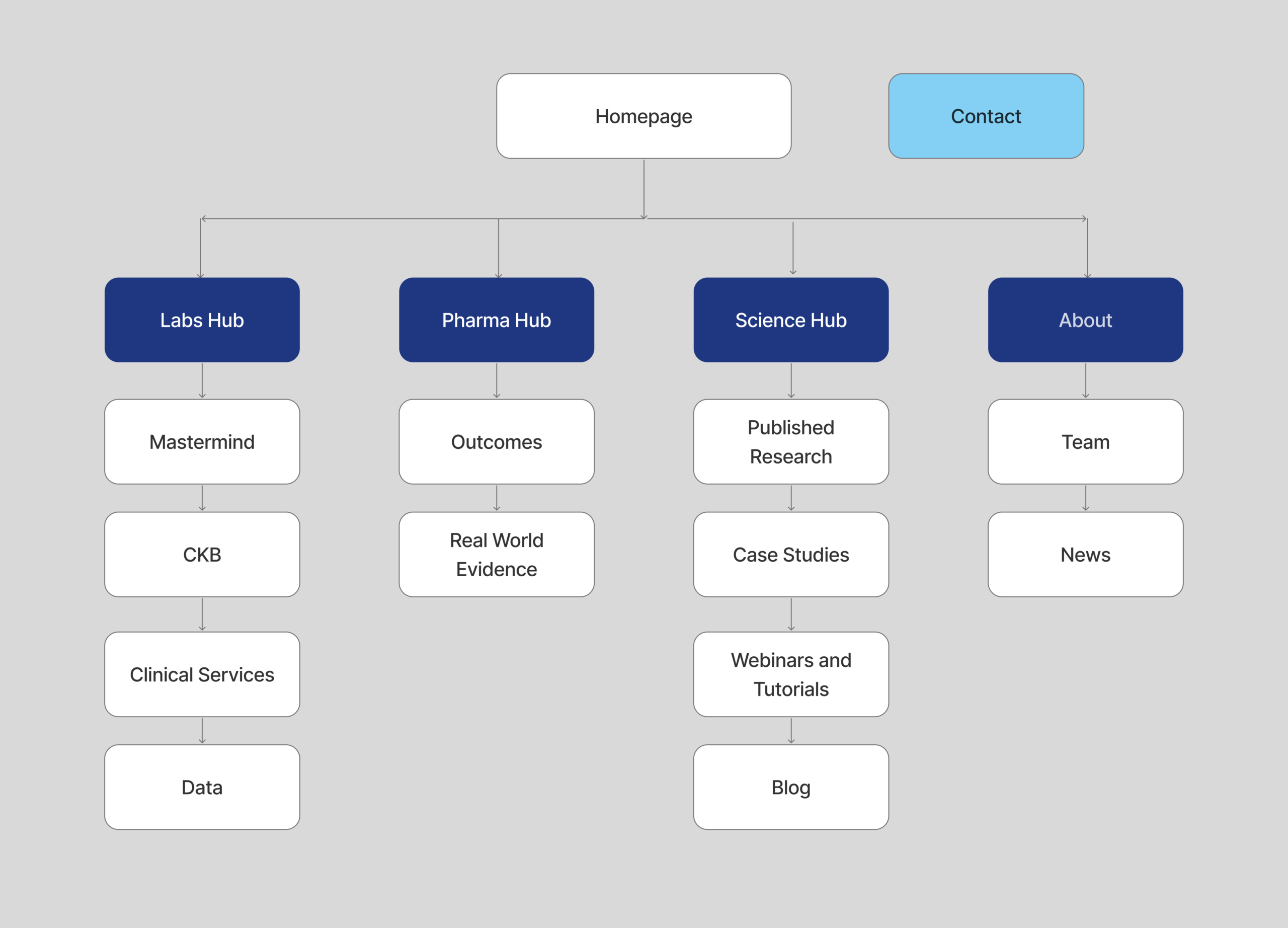
Simplified navigation by using information hubs.
There are two distinct audiences that require separate paths: clinical labs and biopharmaceuticals. Before, there were several offerings pages for each audience to make a choice between immediately through the navigation bar.
To improve the UX, I created a split path on the homepage and navigation. I created “hub” pages where a user can see an overview of all the information relevant to them. Now, the two audiences receive only information dedicated to them and can make informed decisions about which offering they’d like to learn more about.
2
designing
High-Fidelity Mockups
Homepage
From our research, we found three categories of necessary inclusions of our design.
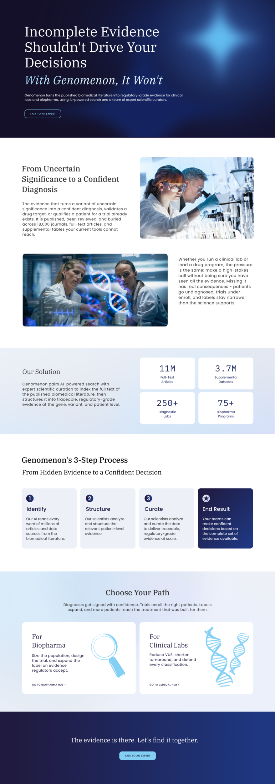
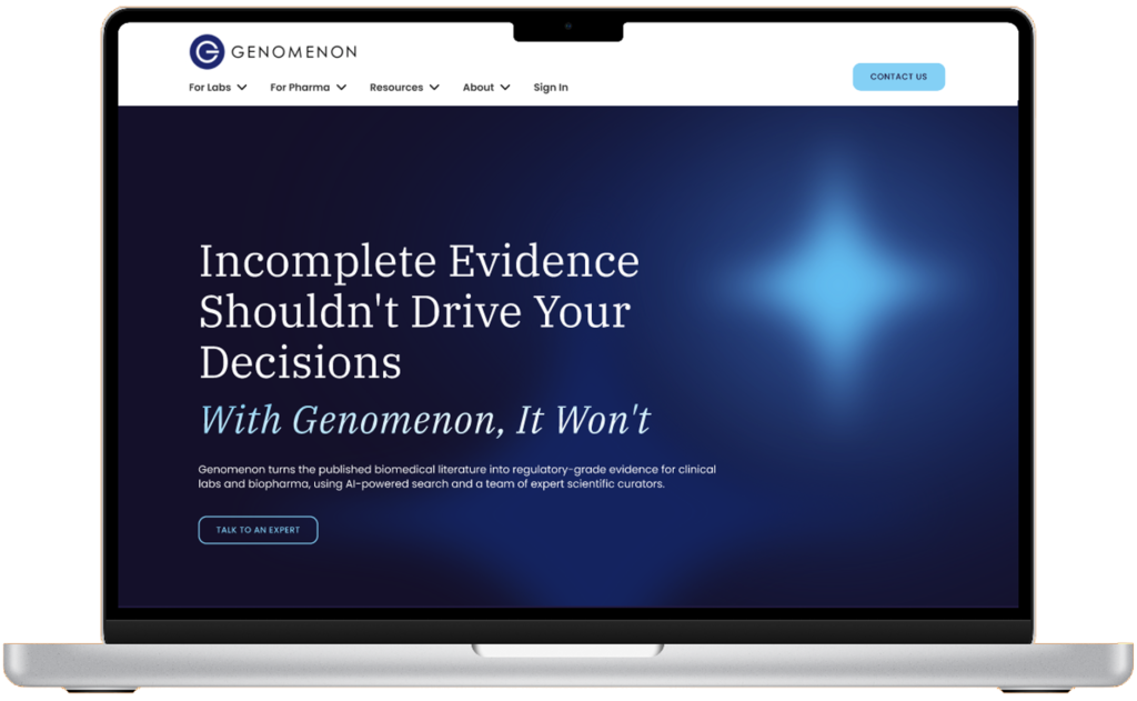
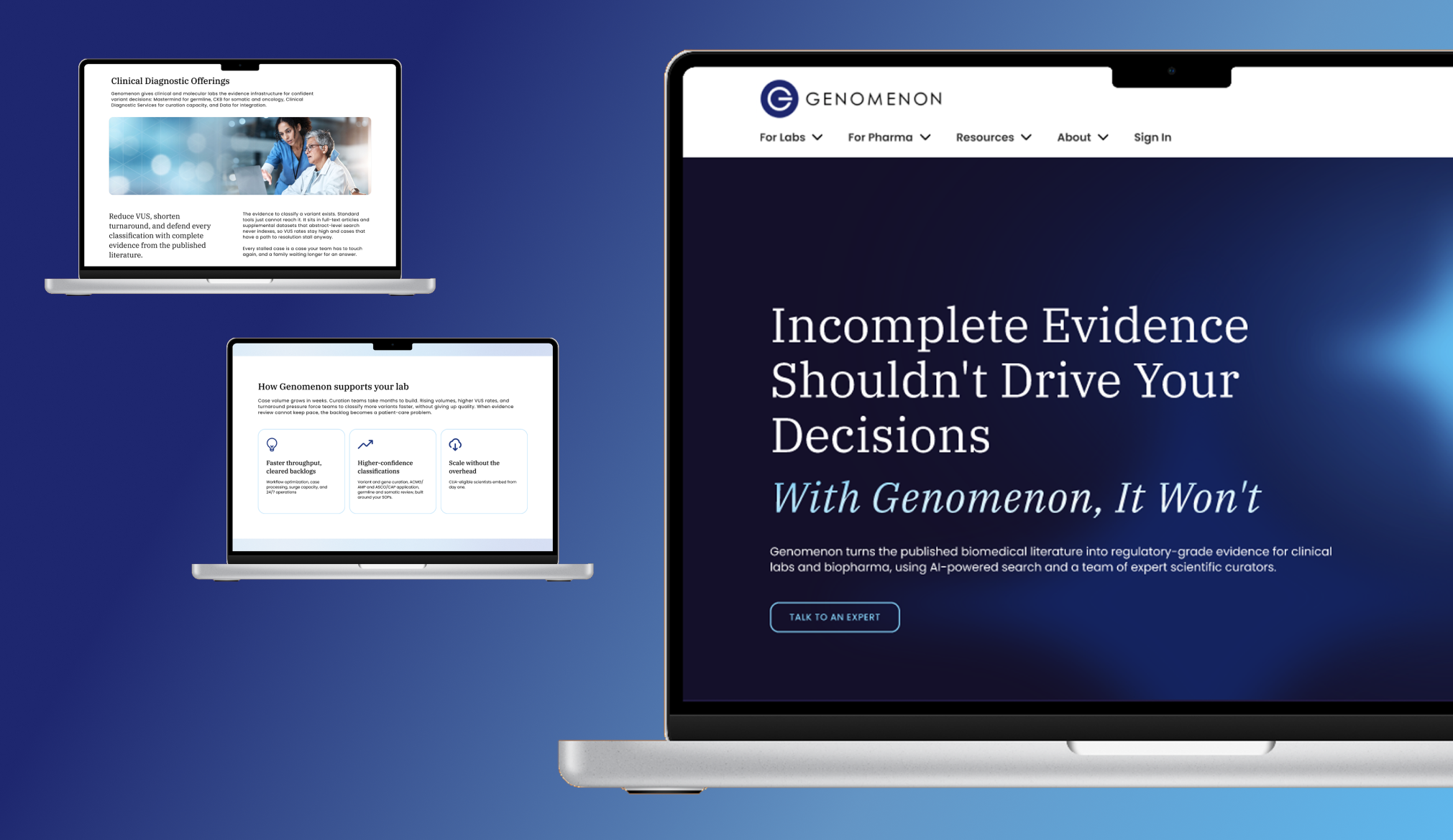
A dark background with bright focal point and large text
Gradient creates a glowing effect on the company's new tagline: With Genomenon, It Won't.
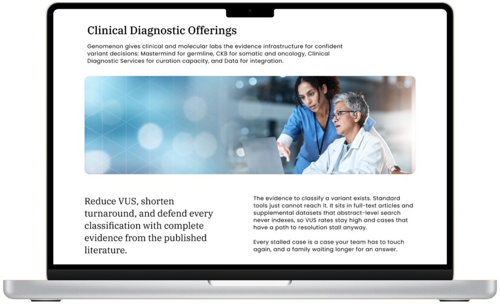
Light backgrounds and extra whitespace make the text more digestible
Bright blue only appears on interactive elements
The strategically placed darker colors will draw your eye to its contrast and make blue interactive elements pop
Because our main goal for users is to provide information, CTA’s aren’t present until the end, but always accessible in the navigation
High-Fidelity Mockups
Main Pages
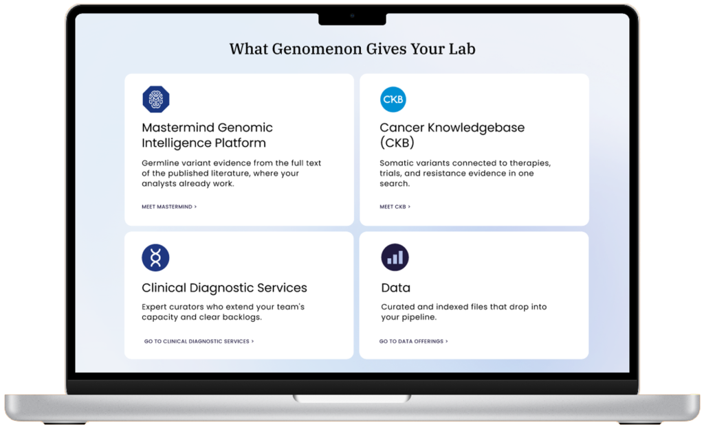
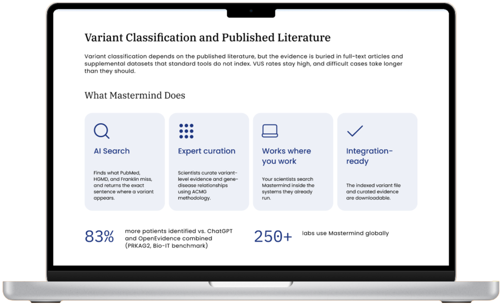
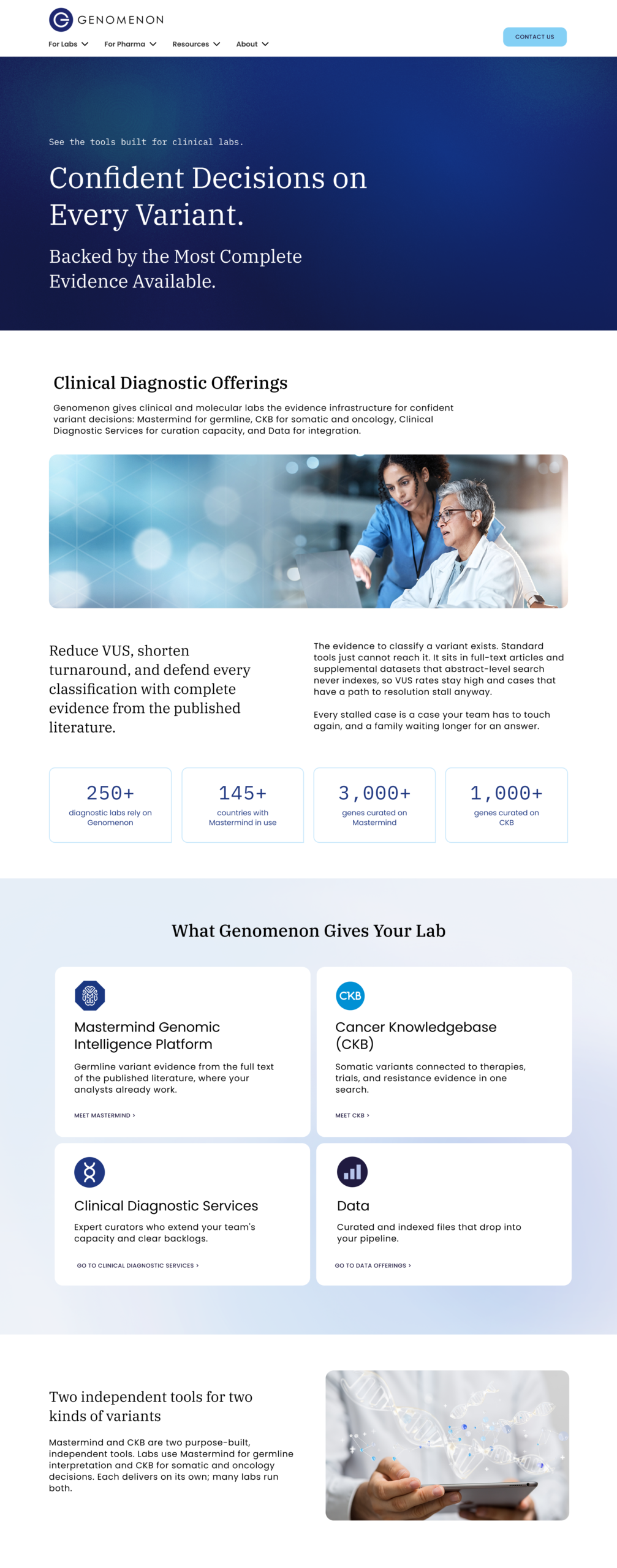
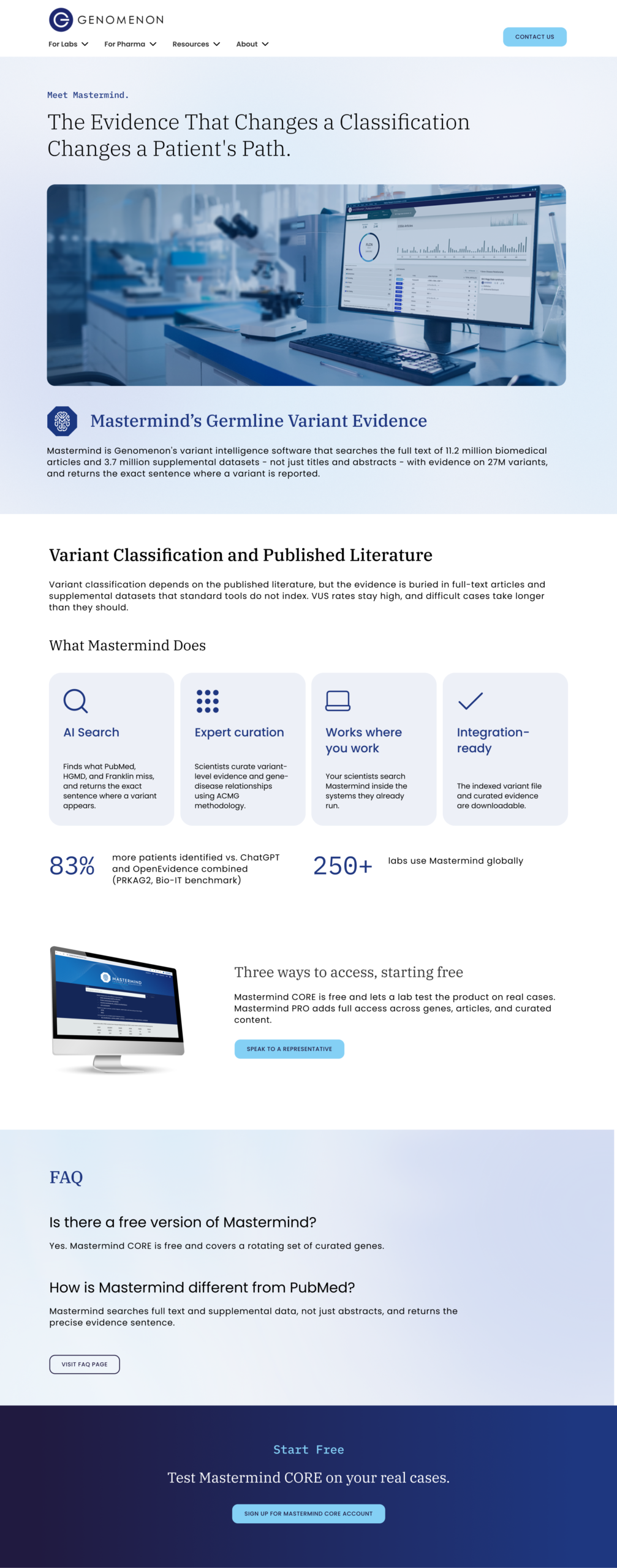
Below is the clinical labs hub page beside a clinical product offering page.
Deliverable
Final Designs