Indiana Neighborhood Website Design
Connecting neighbors through information.
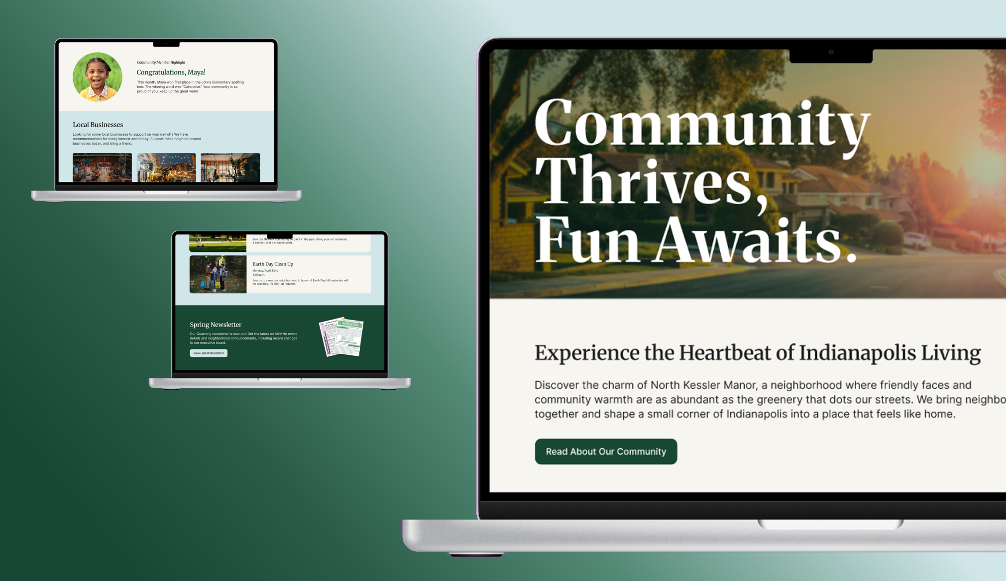
Project Manager, Senior UX Capstone
October 2023 - May 2024
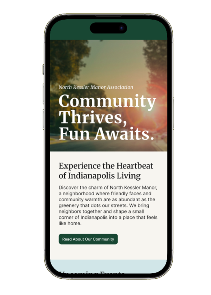
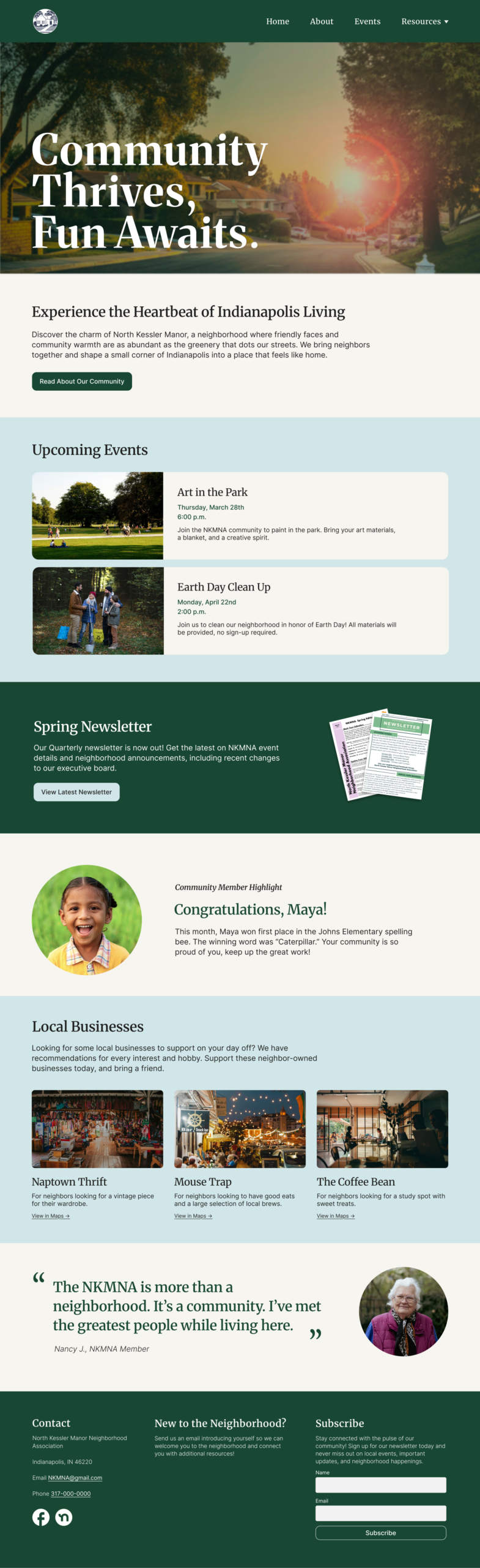
The North Kessler Manor Neighborhood Association (NKMNA) is a volunteer neighborhood organization of elected residents who foster a sense of unity and well-being in the neighborhood by organizing community events. They wanted to create a website for the board members to share neighborhood information easily and in one location.
This project was completed as a Senior UX Capstone at the University of Michigan School of Information. As project manager of a team of four, I organized and contributed to the execution of the user research, design, and evaluation phases.
1
research phase
Problem Statement
They currently reach residents through four communication channels: newsletter flyers, Facebook, Nextdoor, and QR codes. This leads to excessive time and financial resources being dedicated to sharing information.
Research Method #1
Focus Group
Thirteen NKMNA board members joined us on a zoom call. Given the constraint of not speaking to neighborhood residents, we utilized the board membersu2019 expertise in both sharing and receiving neighborhood information.
Our residents know how to use technology, but they resist change.
We need a one-stop shop for information.
Research Method #2
Comparative Analysis
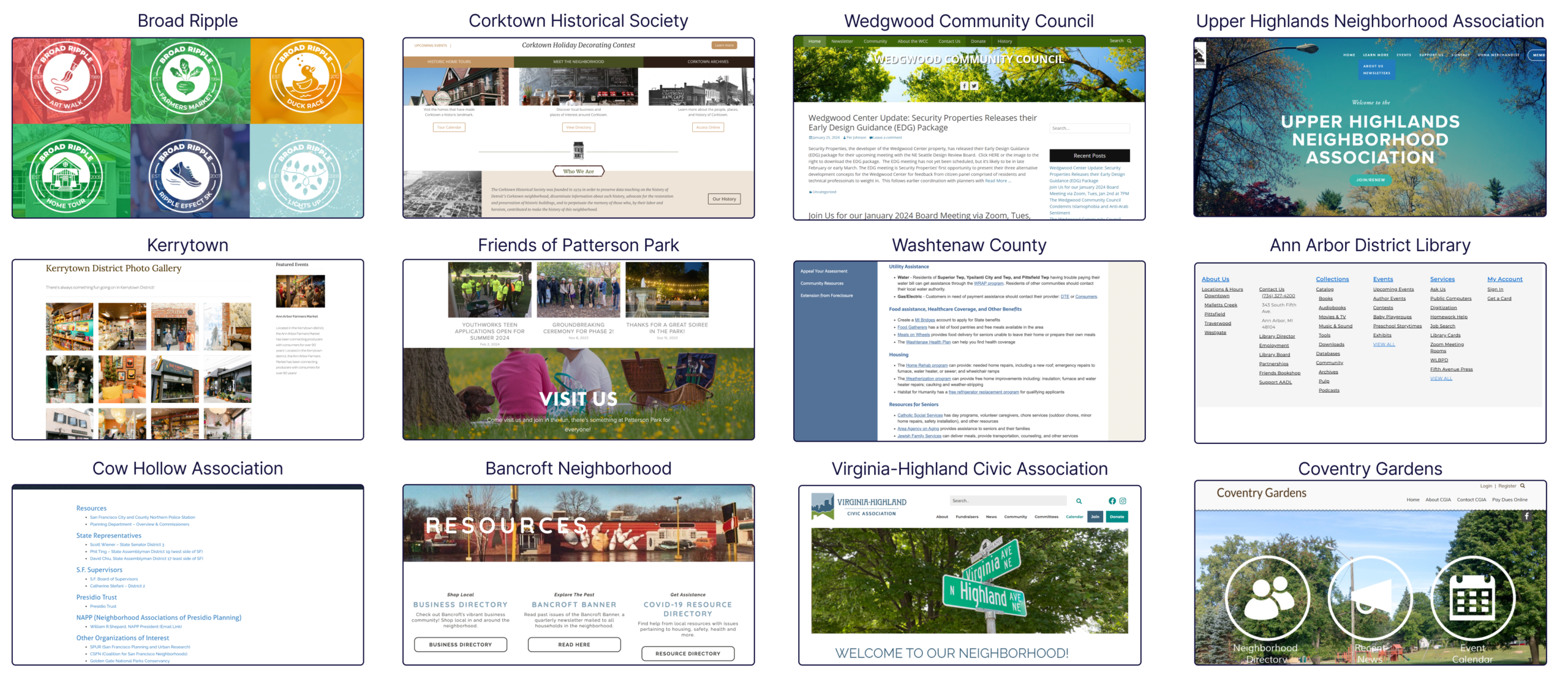
Focusing on the user goals discovered in the focus group, our team evaluated a variety of comparable neighborhood and community websites. The design decisions and takeaways from these comparators informed our UX Requirements.
2
design phase
UX Decision #1
UX Requirements
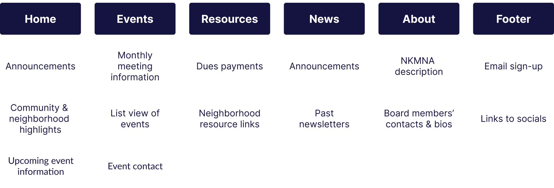
From our research, we found three categories of necessary inclusions of our design.
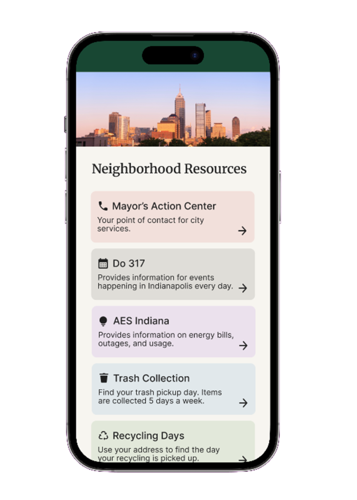
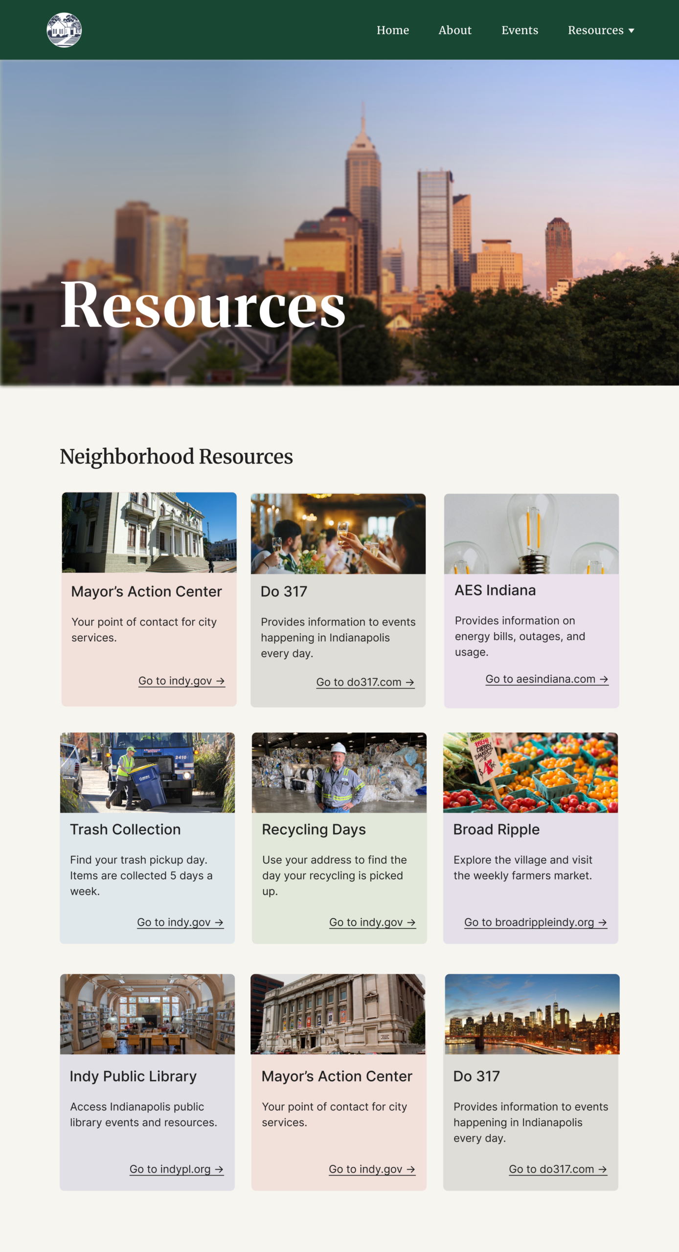
Resources Page
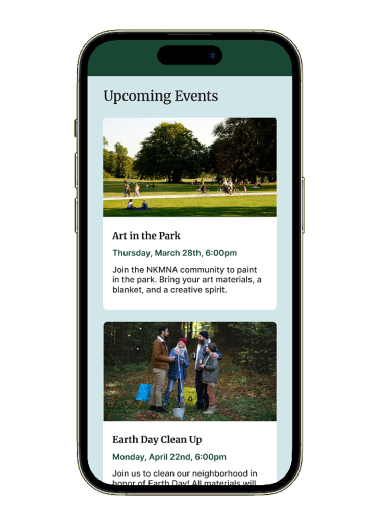
Events Page
About Page
Pay Dues
Email Sign-Up
Contact the Board
Announcements
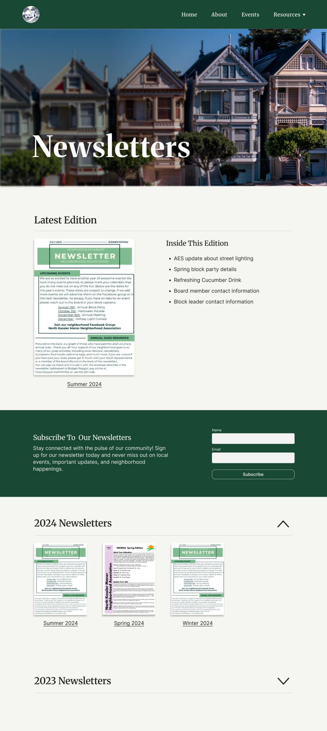
Display Newsletters
UX Decision #2
Information Architecture
Wireframing
Low-Fidelity Designs
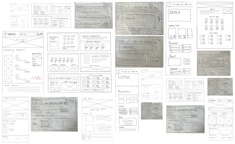
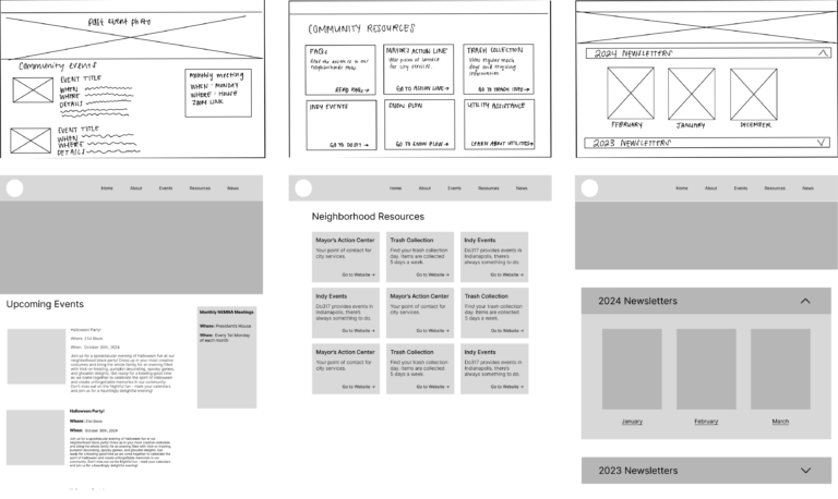
Brainstormed many page designs for each header of the early navigation menu. This provided us with a wide range of possible layouts and features. Then, we combined our most effective designs into a composite sketch for each page to serve as our blueprint for low-fidelity wireframes.
Branding
Style Guide
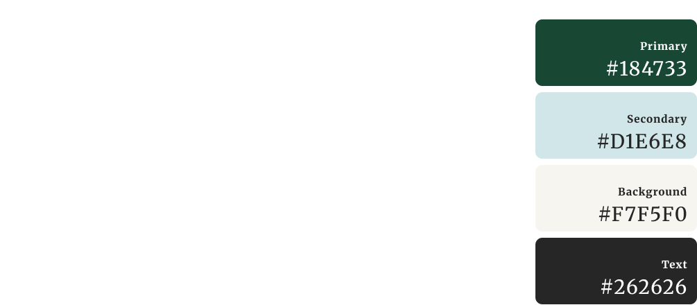
We chose fonts that felt like a newsletter to reflect the original purpose of the site.
The bright colors represent the community culture of being outdoors, green gardens under blue skies.
Feedback
Design Iterations
Meetings, presentations, and early testing led to changes in UI and information architecture.
Visual cues
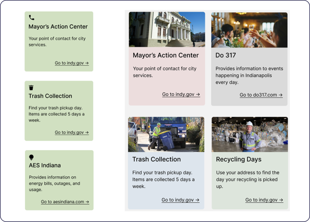
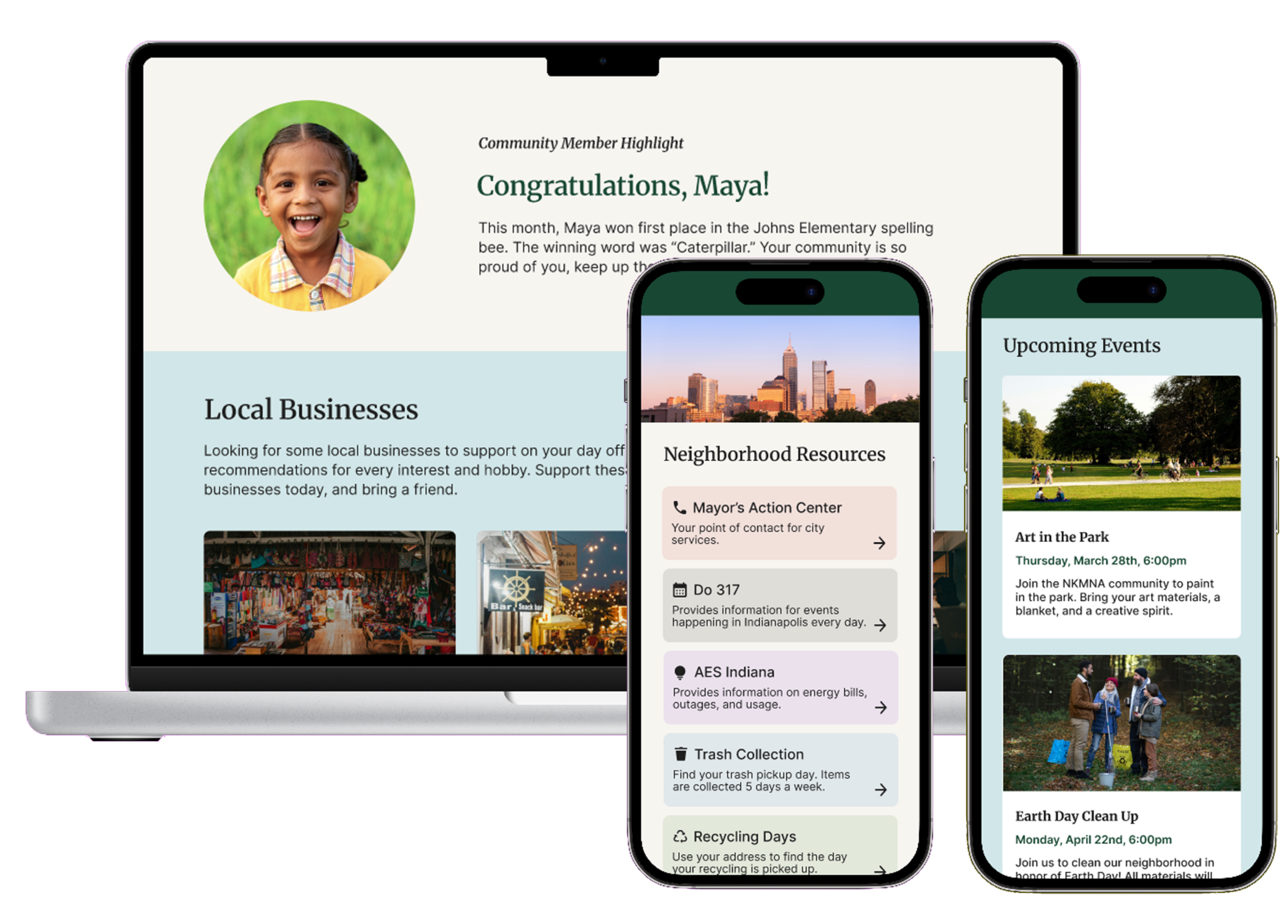
Added photos and unique organization colors to create visual appeal and recognition.
Ease of Completion
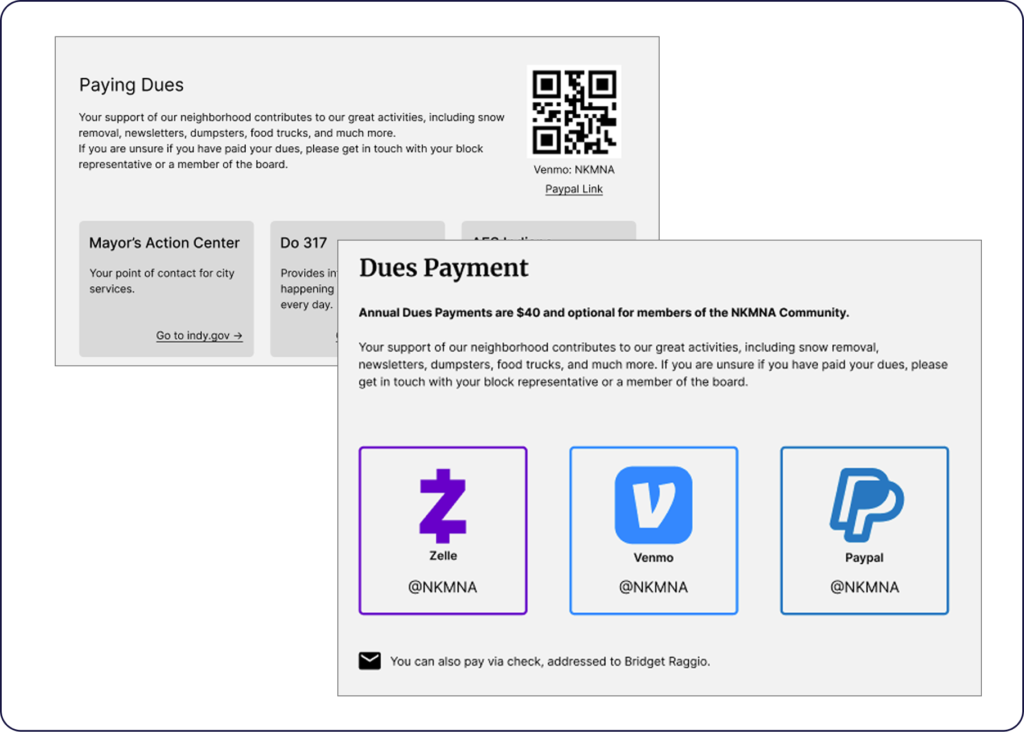
Paying dues was one of our main UX requirements, so we moved the dues information to its own page. Adding brand icons, colors, and names aid in faster recognition.
Quick Access
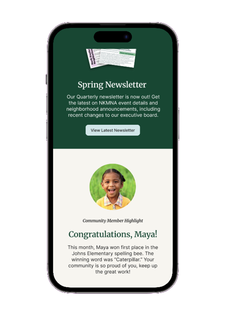
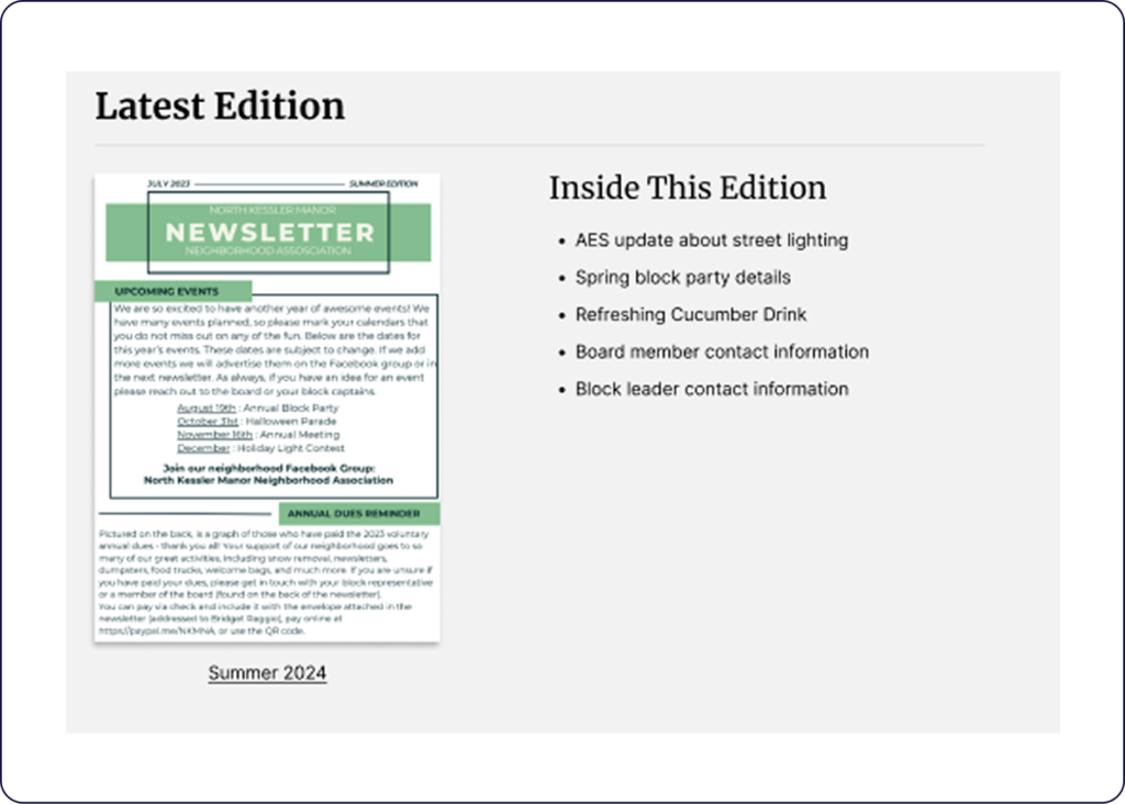
Included a Latest Edition feature with bullet point highlights, so residents can see the information before opening the PDF.
3
evaluation phase
Evaluation Method
Usability Testing
We conducted six usability tests with neighborhood residents, with tasks aimed at ensuring all of our UX requirements were met.
Can participants locate the NKMNA phone number?
Can they tell us the location of the next NKMNA event?
Can they find the username for the NKMNA Zelle account?
Evaluation Results
Completion and Ratings
After each task, we asked participants to rate the ease-of-use out of 10, with 1 being nearly impossible and 10 being extremely easy. This provided insight into where the process can be further simplified to reduce cognitive load.
100% of tasks were completed by all participants without assistance
93% average ease-of-use rating by participants
Deliverables
Final Designs
After the high-fidelity mockups were approved, I developed the designs using Webflow.